PROJECT: Brand Identity
CLIENT: Ascension CBD Dispensary
JUNE 2023 - NOVEMBER 2023
Overview:
Ascension CBD Dispensary is a retail distributor located in West Village - 329 6th Avenue, New York, NY 10014 that is set to open on November 2023.
Slogan:
“Elevate Life Naturally with Ascension CBD: Where Wellness Meets Well-being.”
Mission Statement:
At Ascension CBD Dispensary, our mission is to empower our customers with the natural benefits of CBD, assisting them in achieving balance, relaxation, and overall well-being. We believe in harnessing the synergy of nature and science, and our team is deeply passionate about sourcing and offering only the finest CBD products available.
Vision Statement:
Our vision at Ascension CBD is to be the trusted destination for premium CBD products, fostering a community where individuals experience the transformative benefits of cannabinoids. Guided by commitment to quality, education & personalized care, we strive to redefine the well-being journey, making CBD accessible to all for a healthier, more balanced life.
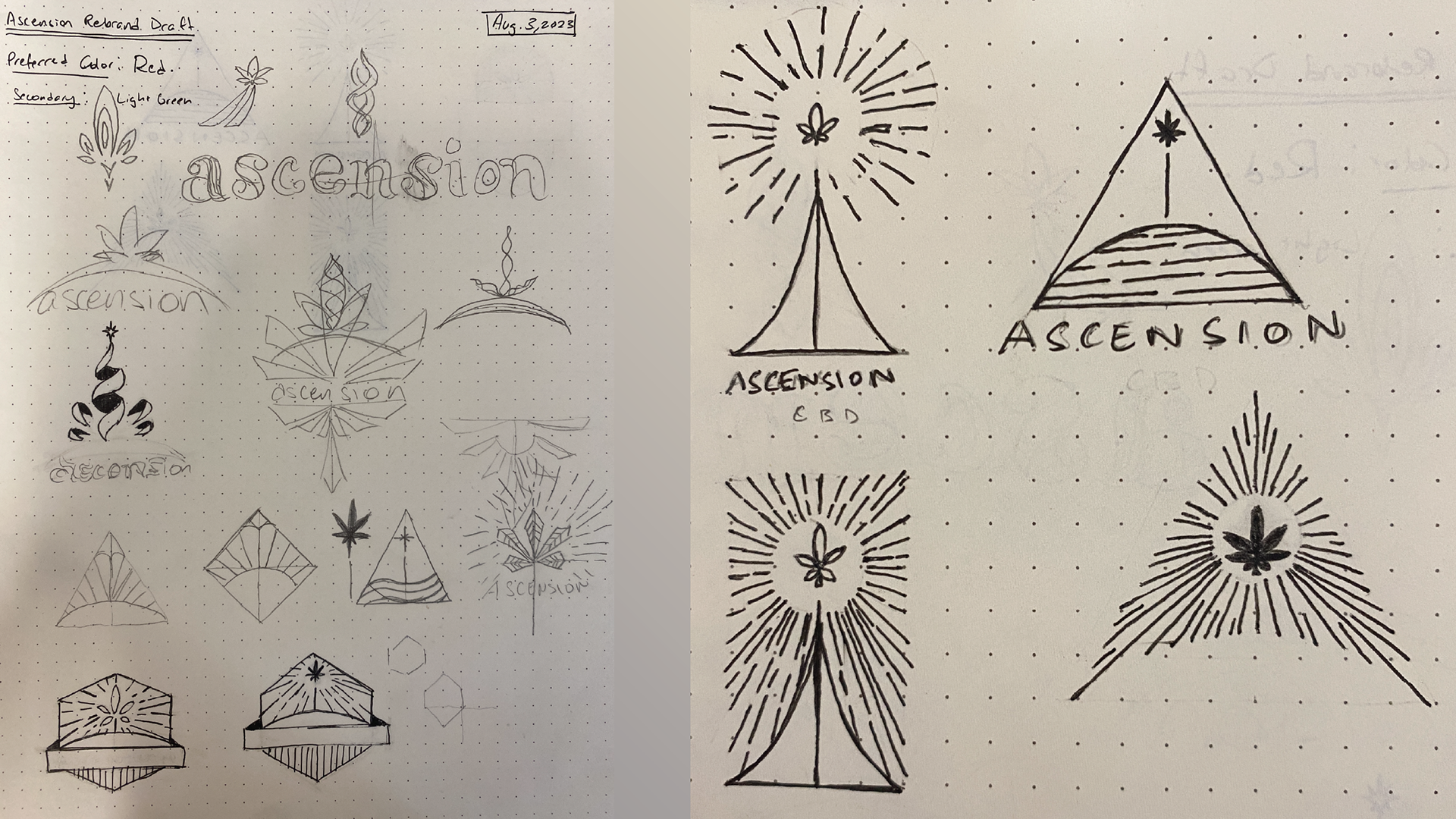
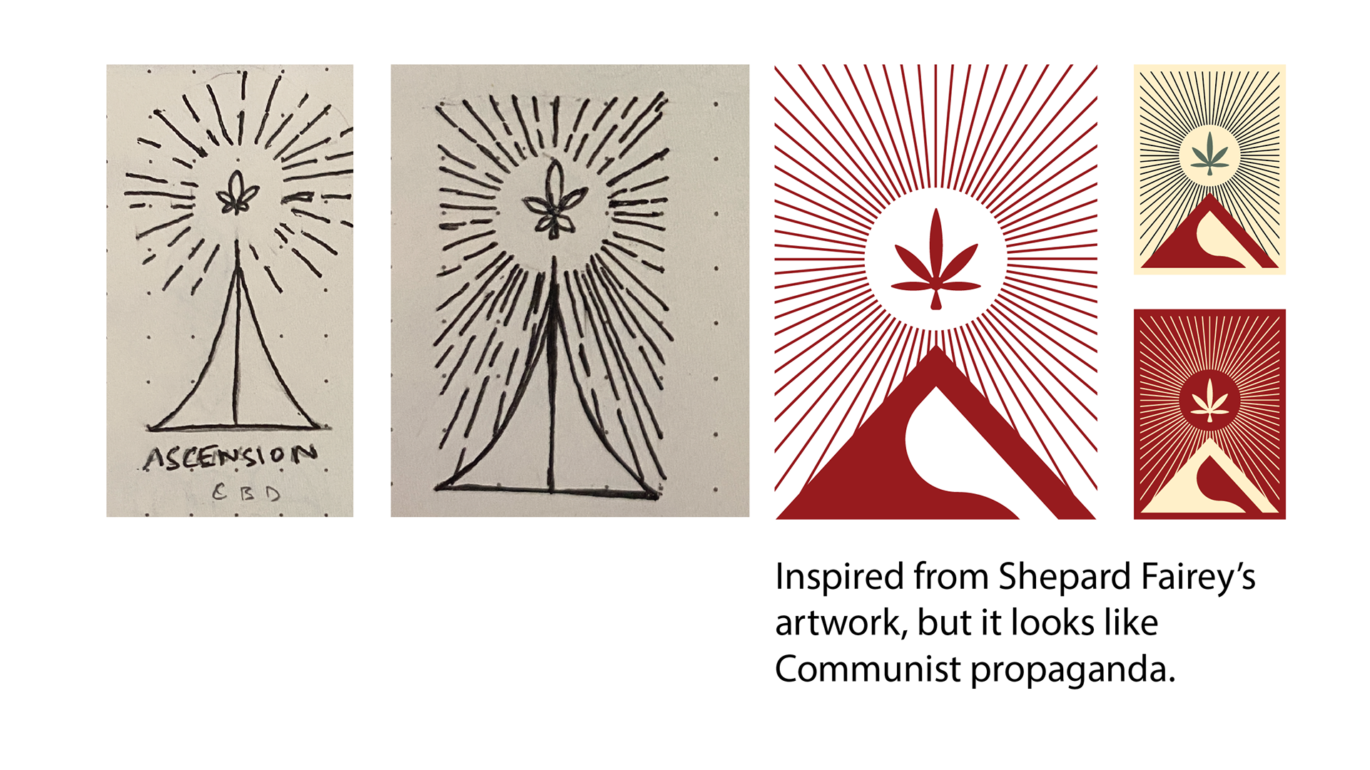
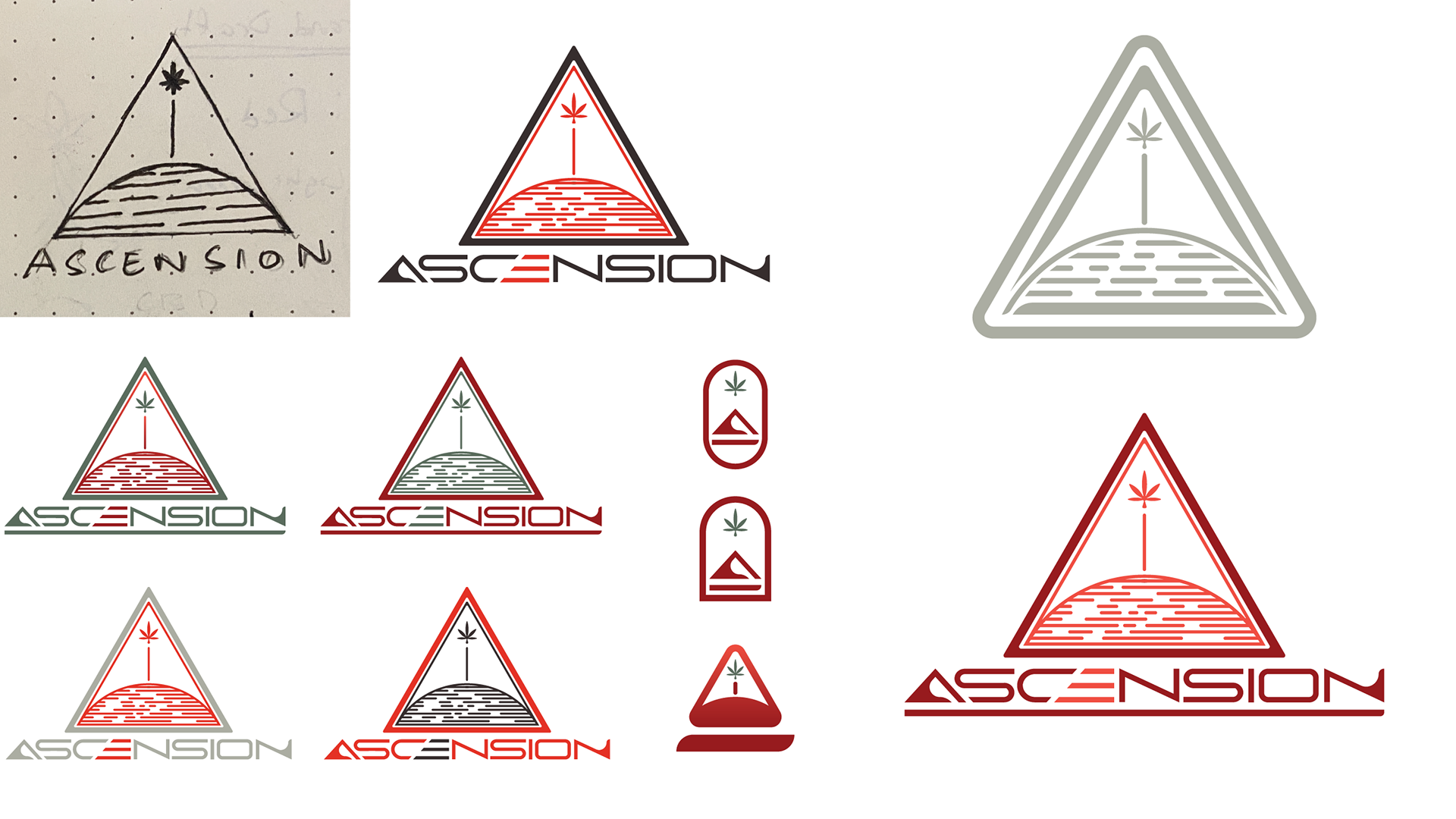
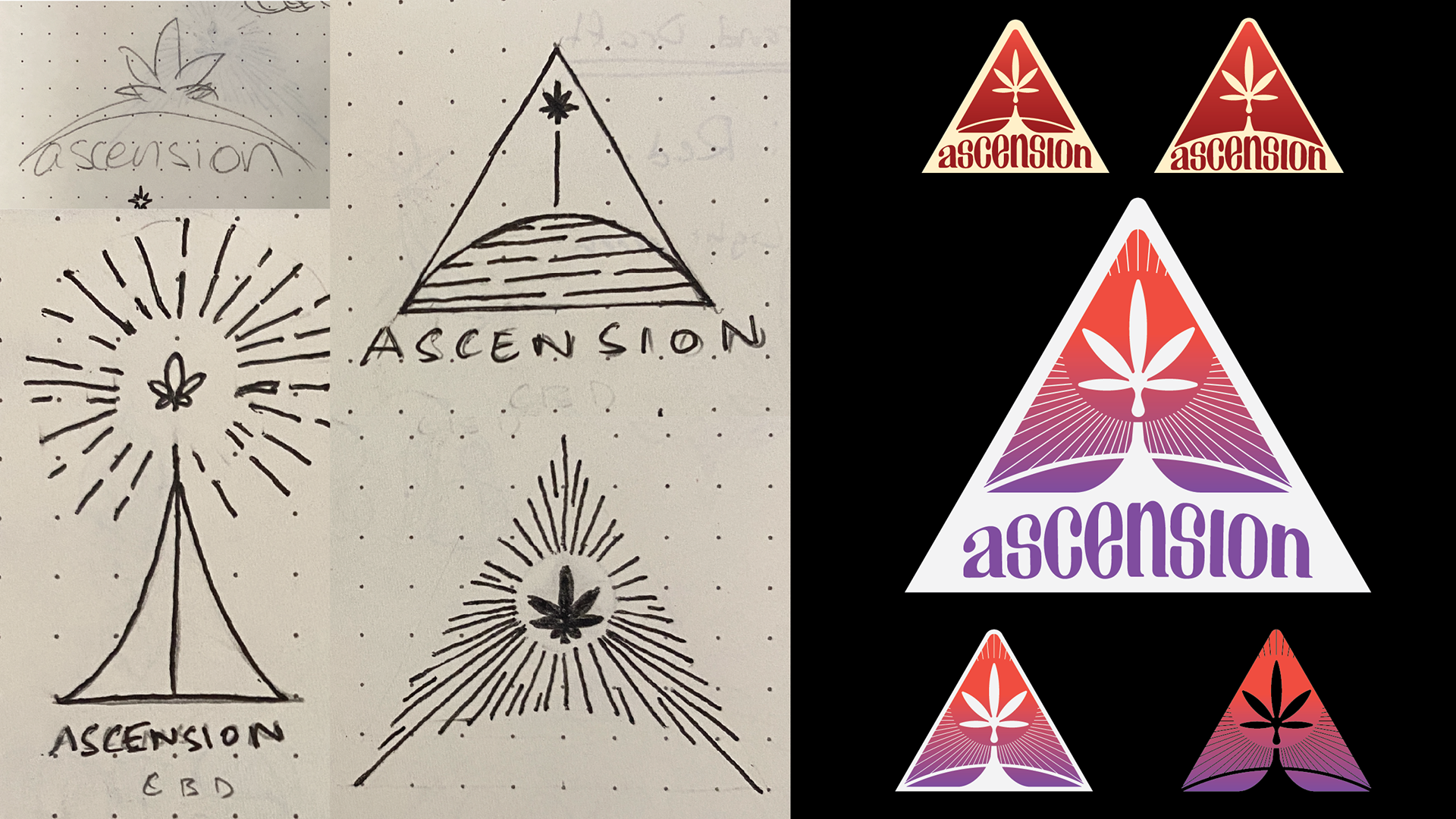
DRAFTING PROCESS

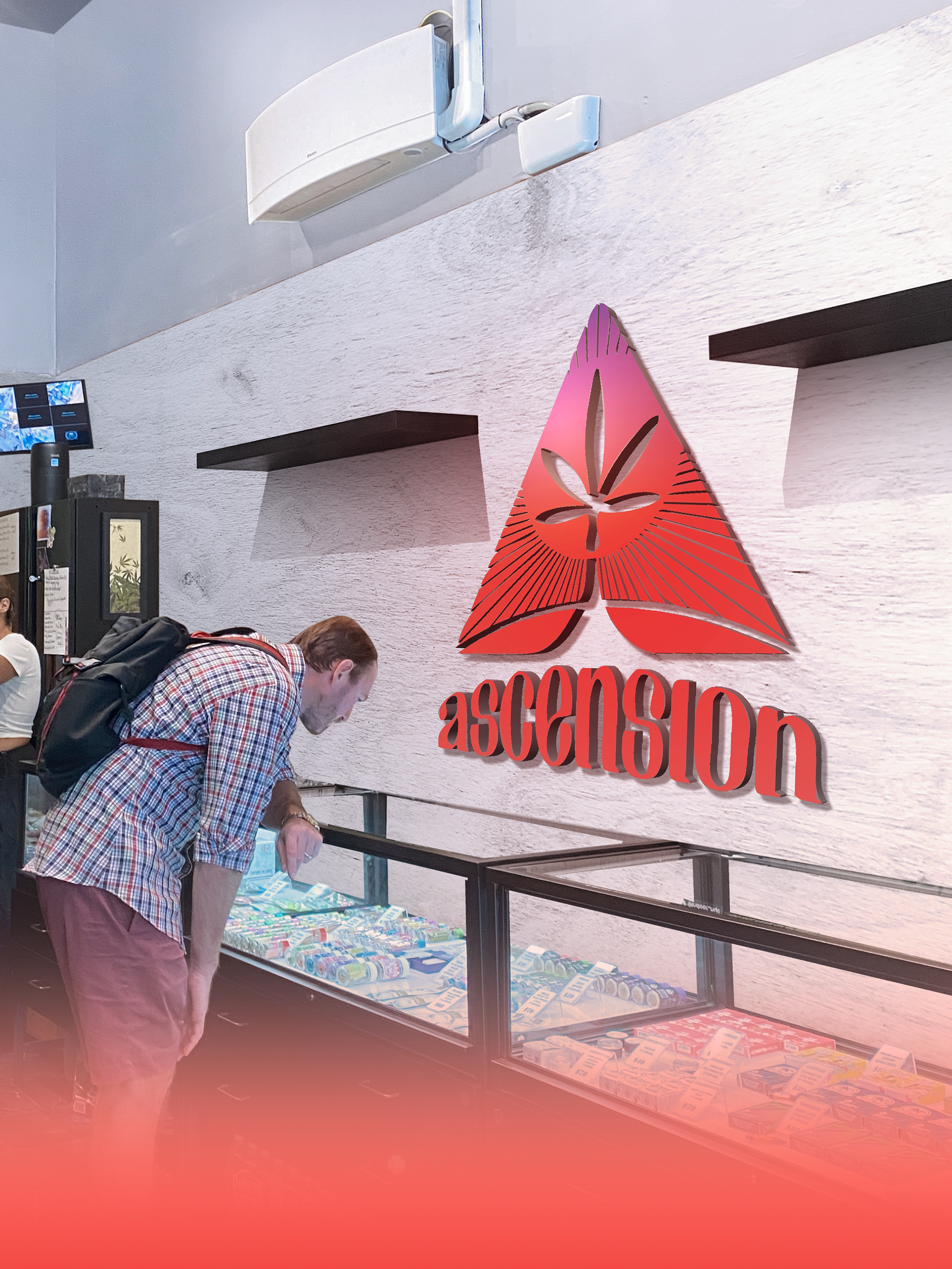
Store Concept Mock-Up
This Mock-Up was created using an image of one of the existing dispensaries managed by the client.
With the image provided, I was able to create a vision of what the store could potentially look like. A balance of pure white and light gray to give off simplicity and cleanliness. These combinations serve to highlight the signature red that is associated with the brand.
The walls are designed with the top half being a plain, light gray flat wall, and the bottom half with white wooden texture. The gray serves as a simple space filler that does not make the mood of the space feel short. The wood texture is a reflection of the natural content of the offerings and lifestyle associated with the brand. It's kept white in order to shift viewer's attention more towards the logo set to be manufactured and installed, as well as any other brand collateral.
LOYALTY CARD
STORE SIGNAGES
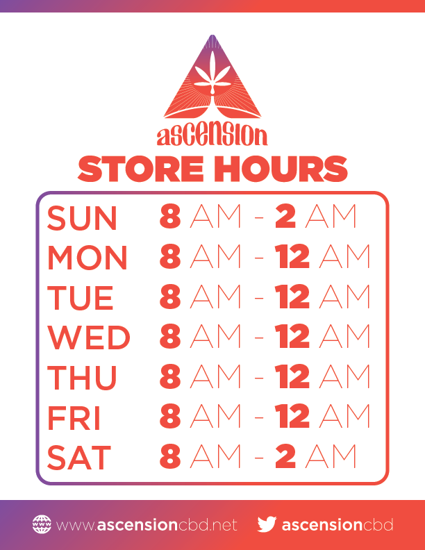
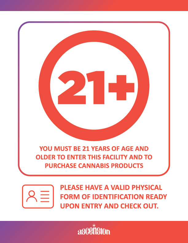
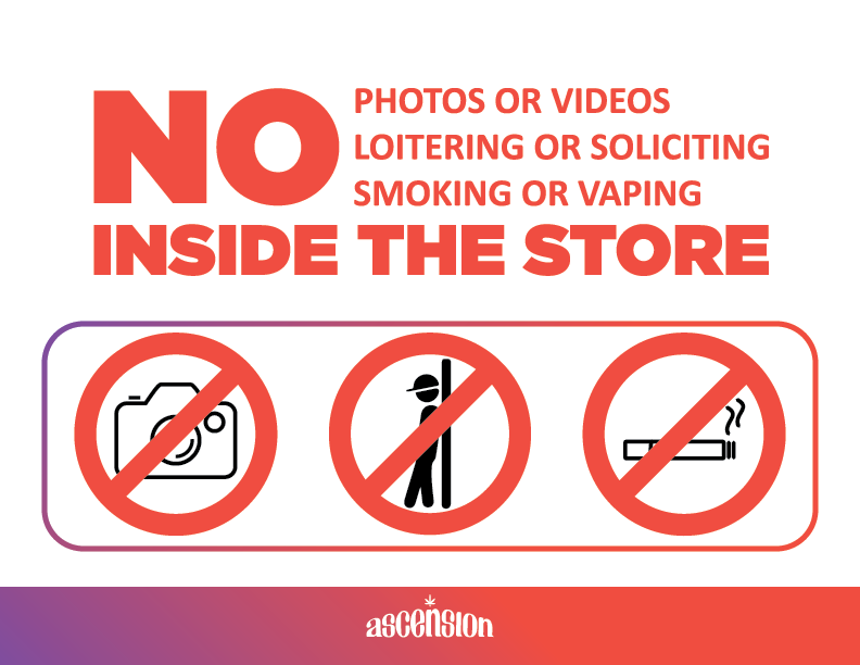
STORE MENU & BUNDLE DEALS

