PROJECT: BRAND IDENTITY + PACKAGING DESIGN
DATE: Feb. 2023 - May 2023
Mission Statement:
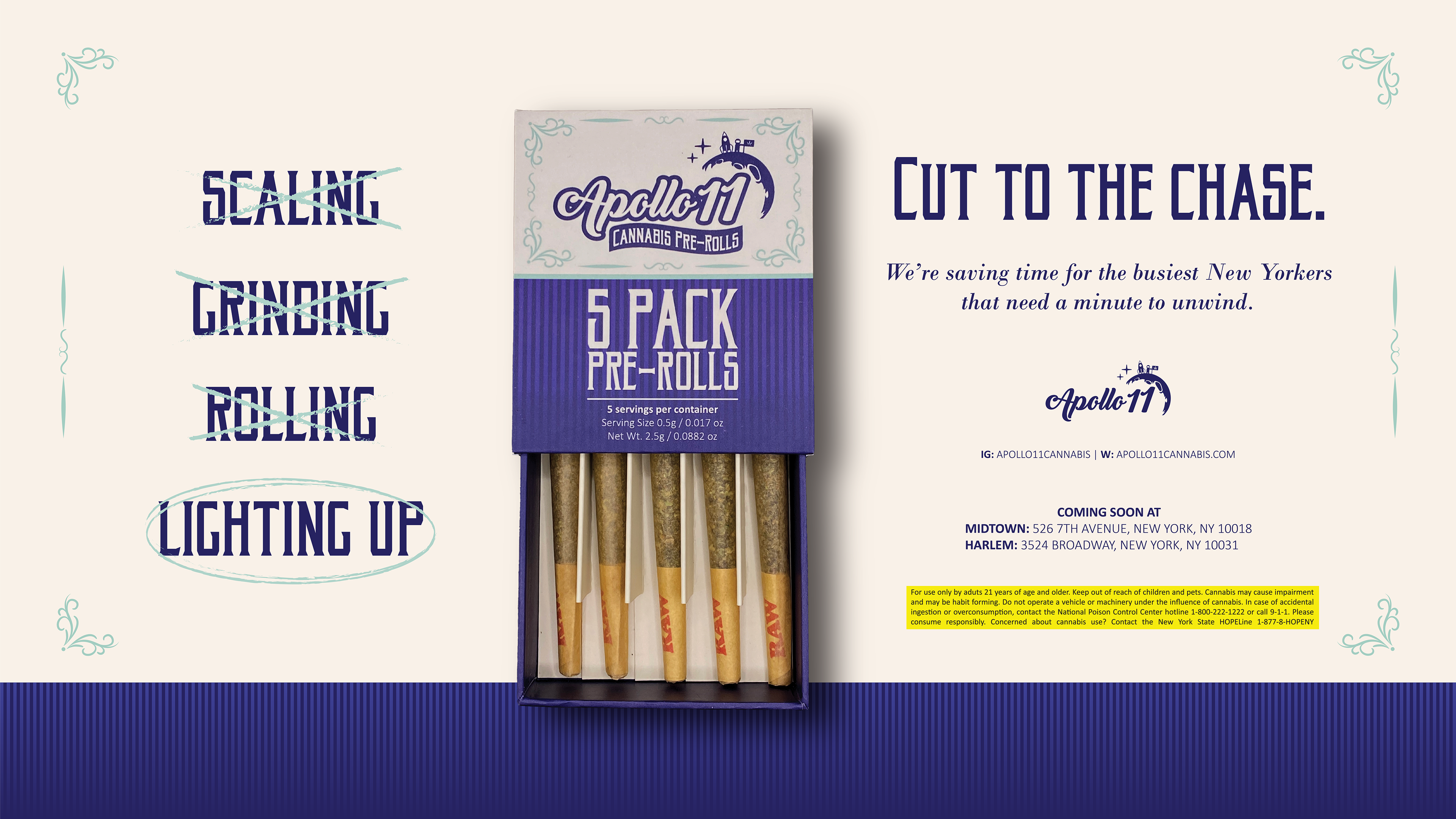
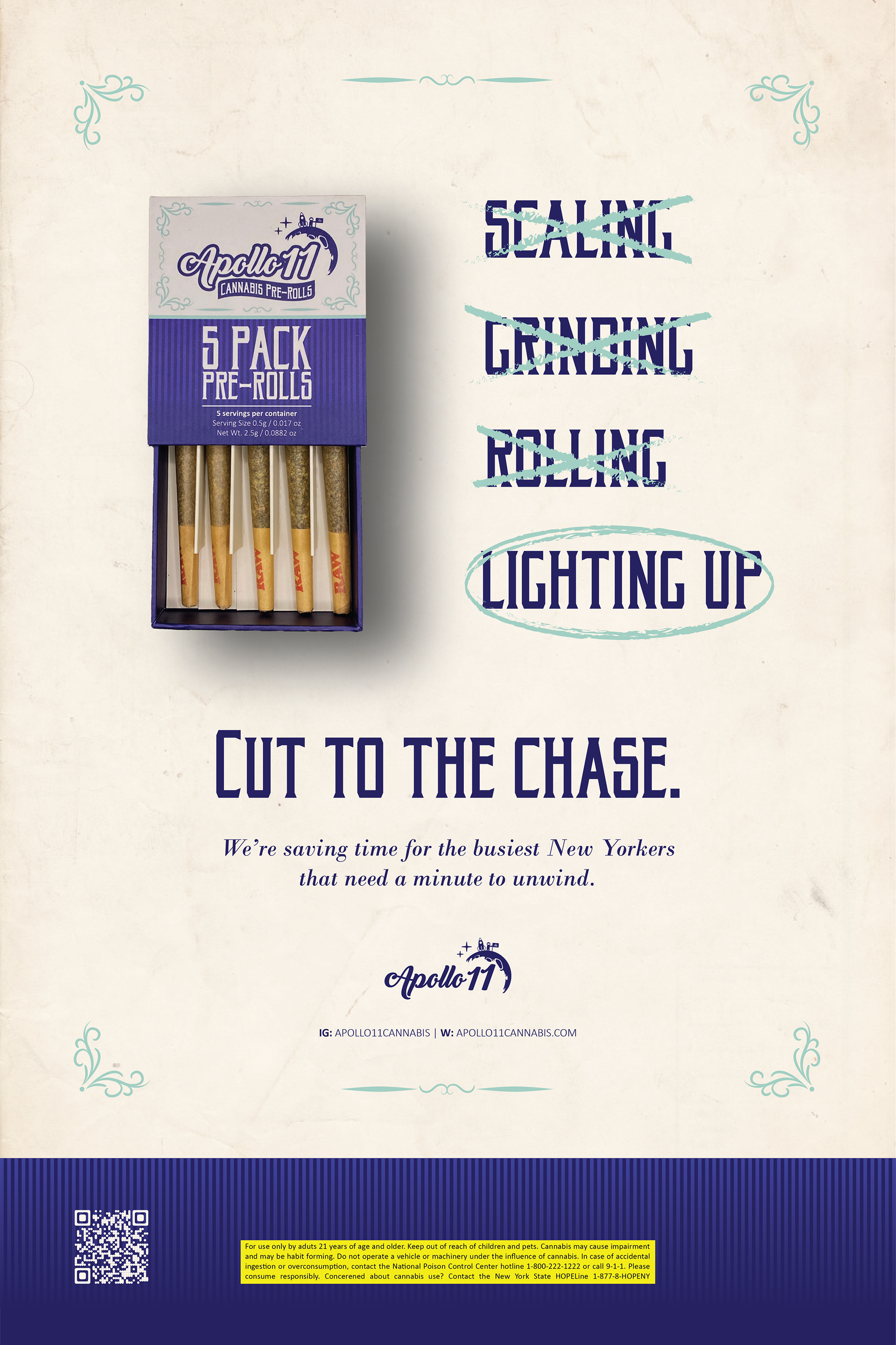
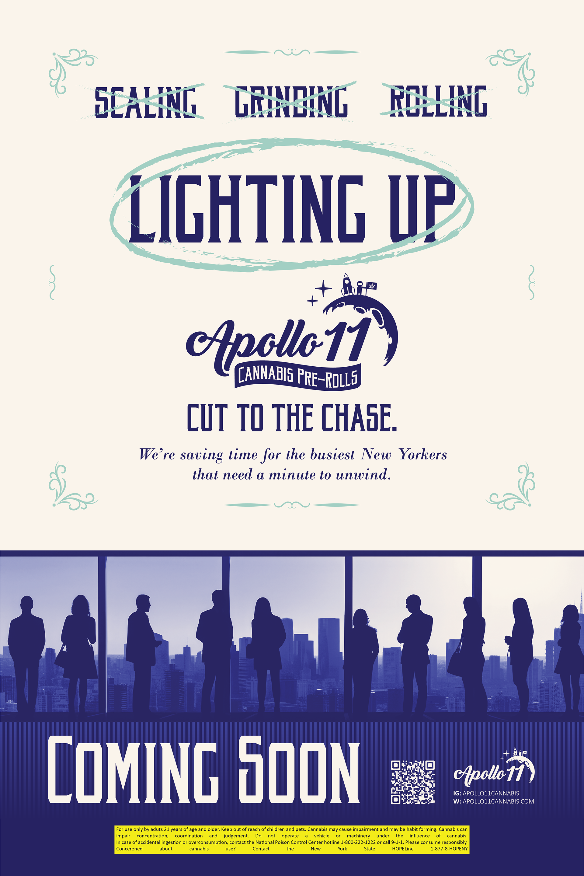
Apollo 11 is a cannabis pre-roll product that eliminates the inconveniences of having to scale, grind and roll up, ultimately saving time for the busiest New Yorkers with a minute to unwind.
Objective: Brand Identity + Packaging Design
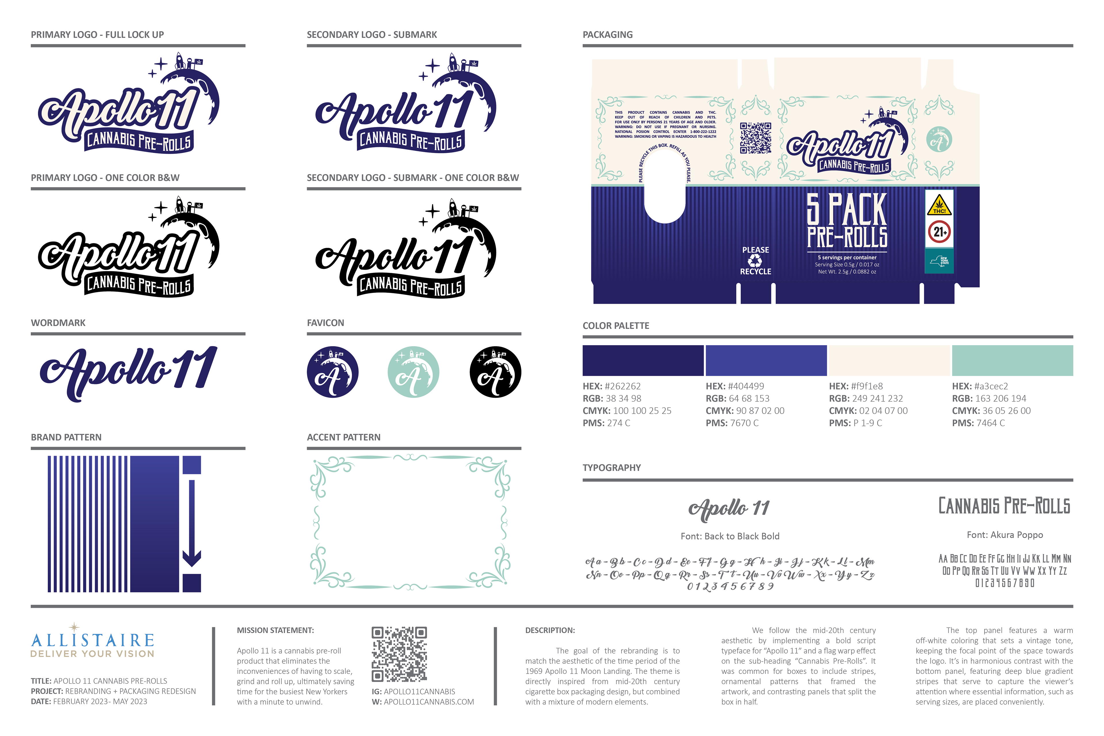
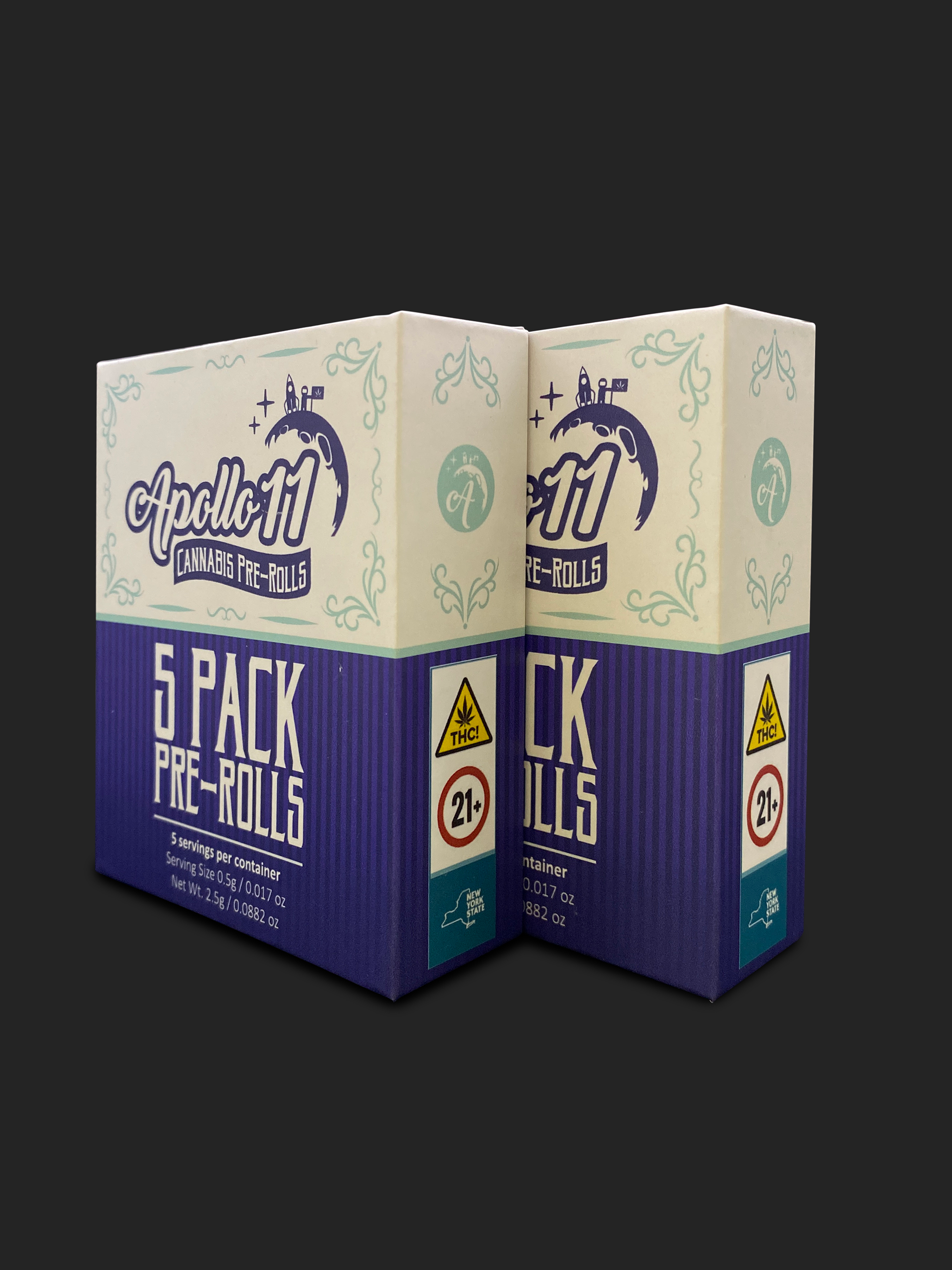
The brand was designed to reflect the aesthetic of the 1969 Apollo 11 Moon Landing era, drawing direct inspiration from mid-20th century cigarette box packaging while incorporating modern design elements.
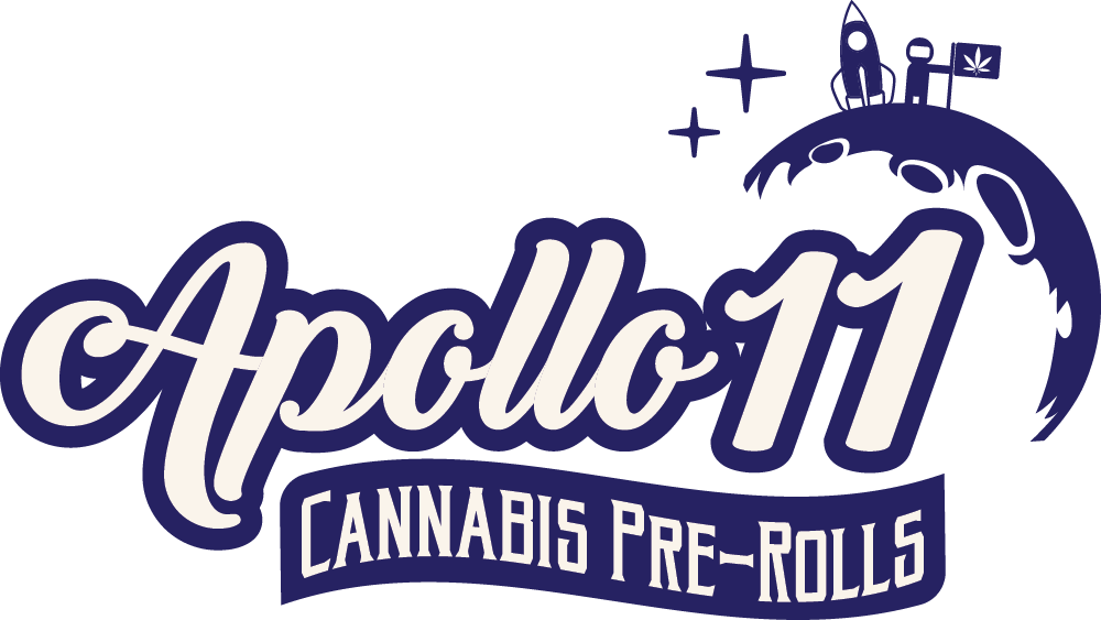
To evoke the retro feel, we used a bold script typeface for 'Apollo 11' and applied a flag warp effect to the subheading 'Cannabis Pre-Rolls'—a nod to typographic styles of the time. Traditional design cues like framing stripes, ornamental flourishes, and contrasting panel divisions reinforce the vintage character.
The top panel features a warm off-white tone, setting a nostalgic mood and drawing attention to the logo. In contrast, the bottom panel uses deep blue gradient stripes to balance the layout and highlight key information such as serving sizes.
Favicon
This new favicon design features a repositioning of the moon, with minor details removed, resizing of the spaceship and astronauts, and a pair of stars included to fit the setting.
This simplified icon features the letter A used from the full logo, strategically made to fit inside of the moon while remaining as the focal point of the image, maintaining the moon's position as the secondary element.

Wordmark
This logo variant prioritizes simplicity in order to have more applicable uses. Other elements have been removed, expanding its capability for small scale or long distance application.

Brand Identity Guide - 12" x 18" Poster
Packaging Features
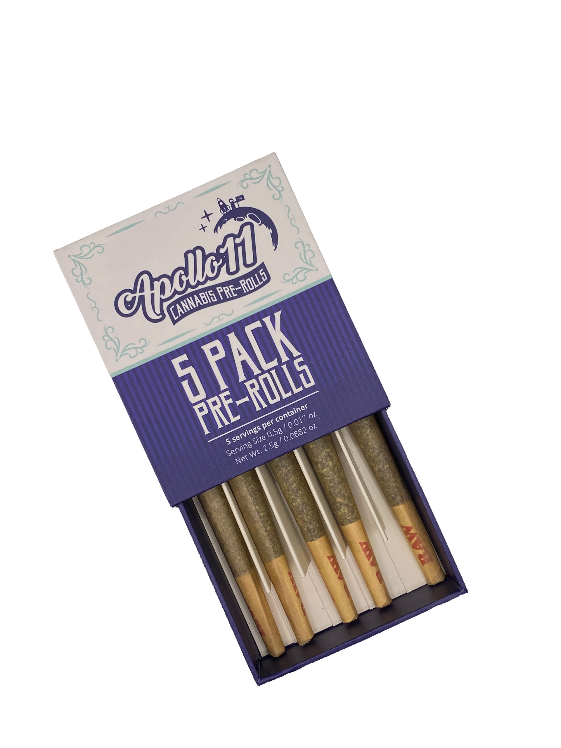
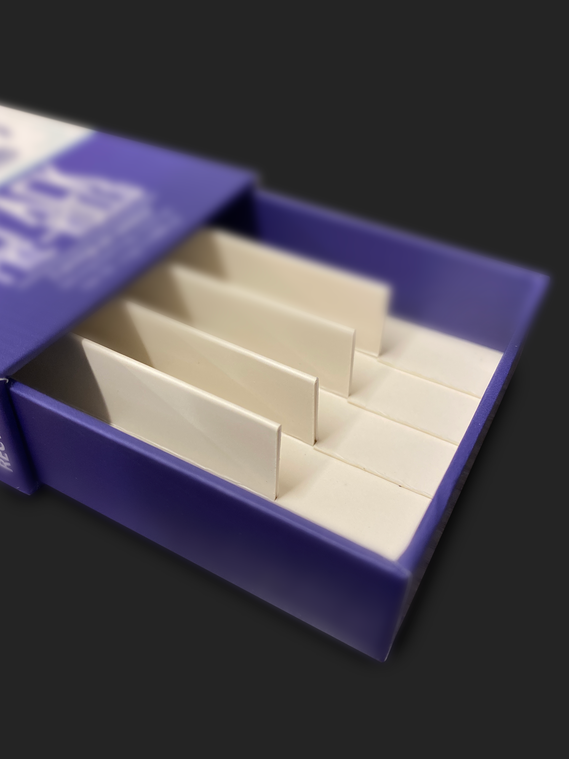
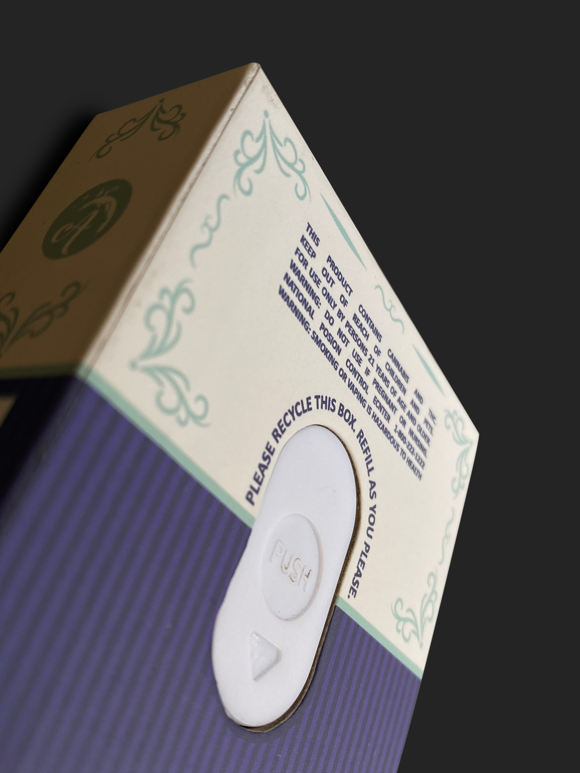
The packaging consists of a sturdy cardboard box with a child-resistant insert that neatly organizes the pre-rolls between dividers for secure storage.
Additional features include a clear message encouraging consumers to recycle or refill the box, promoting a reduction in short-term waste. While the packaging is made of paper, and the use of pre-rolls may naturally affect its condition over time, consumers are also encouraged to replace the box periodically to maintain the quality and freshness of its contents.
Objective: Marketing
Following the completion of the brand identity, the next phase focused on marketing the product. The core message of the advertising campaign highlights the convenience it offers—eliminating the tedious preparation process so consumers can light up instantly, without delay.
The campaign is tailored to New York’s working class—individuals seeking a quick break in a fast-paced environment or a well-earned reward after a long day, without having to wait for relief.
The ads also spotlight the improved product design, featuring a new divider system that securely holds the pre-rolls in place—a functional upgrade from the original insert, which lacked proper support.
Coming Soon Poster
Web Banner